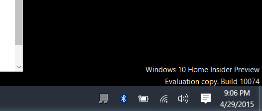
Windows 10 Build 10074
This new build comes on the heels of the last release, build 10061, and shows that Microsoft wasn’t kidding about releasing builds faster. Another subtle change is these builds are now labeled Insider Preview versus Technical Preview, which is a reflection on the pace of these releases, and the approaching final release date.
This new build is available for Windows Insiders who are part of the Slow and Fast ring. Since the Slow ring is included, you can download the ISO images now, too. That allows you to create a bootable USB flash drive using a utility like Rufus or Microsoft’s free utility. Or you can use the ISO to easily install Windows 10 on a virtual machine. During the conference today, Microsoft also mentioned the name of its web browser, previously codenamed: Project Spartan, is now officially Microsoft Edge.
The Aero Glass feature is returning, however, not everyone will get it right away. According to Gabe Aul’s post on Blogging Windows: This makes sense since not everyone will be excited about a return to the older days of the interface look. Of course, if you’re not a fan, you can always disable it in Settings, and make any other UI adjustments to fit your preferences. So, if you’re testing out this latest build, definitely let your voice be heard about this visual effect through the Windows Feedback app. Another new feature includes new default Windows system sounds. Based on user feedback, new and fresh sounds have been added for different actions i.e., notifications, startup, inserting a flash drive, error messages. The Continuum experience or (Tablet mode) in Windows 10 has been upgraded, which is mainly used on 2-in-1 devices like a Surface 3 and tablets. It includes a simplified taskbar, and you’ll get the Start screen instead of the desktop when you close an application in tablet mode. Have you had time to explore the new build yet? Or are you sitting back and observing how Microsoft is changing Windows? Leave a comment below and let us know your thoughts! The current style trend today seems to be flat, flat and more flat with garish colors. And I am not a fan of that at look at all. There was a time in the distant past when Windows had flat things, sunken things and raised things. Flat things you read, sunken things you entered data into and raised things you clicked. Now it’s “whack-a-mole” as you click here and there to see what is what. Or swipe in various directions to see what might happen. Is this a user interface or a hidden-object game? Comment Name * Email *
Δ Save my name and email and send me emails as new comments are made to this post.

